Arrow Infographics Templates
In the world of presentations and visual storytelling, the impact of compelling visuals cannot be overstated. One such visual element that has gained immense popularity is the Arrow Infographic. Your game-changing ally.
With arrow infographics, you can say goodbye to bland presentations and hello to dynamic, engaging storytelling. From comparisons to timelines, Arrow Infographics make data dance and information memorable.
Whether you’re a professional presenter, a marketer, an educator, or simply someone looking to convey information effectively, Arrow Infographics can be your secret weapon. With Mighty Slide, explore the world of arrow Infographics as we highlight their types, uses, and importance to elevate website visuals, presentations, and whatnot!
What Is Arrow Infographic?
An Arrow Infographic is a graphical representation that uses arrows to visualize different info, stat, and messages. It conveys information, processes, or ideas in a visually engaging and easy-to-understand manner. So, every presentation pops up, and the audience finds it informative, easy, and alluring.
Arrows are versatile symbols. Also, they indicate direction, progression, connections, and much more, which saves you from writing or presenting something elaboratively. When used effectively, arrow Infographics can transform complex data into digestible insights, making your message understandable and memorable.
Benefits of Arrow Infographics
Arrow Infographics offers a multifaceted approach to enhance communication and presentations. They provide clarity, capture attention, and simplify information. Plus, it will guide the flow of content, emphasize key points, engage the audience, and leave a lasting impression.
Image: Benefits of Arrow Infographics
Clarity
Arrows act as visual guides, providing a clear and structured path for viewers to follow. They break down complex concepts into digestible segments. This ensures that your audience can easily grasp the information presented.
Clarity is especially vital when conveying intricate data or multi-step processes.
Visual Appeal
Arrows inherently possess a sense of direction and movement. So, the visual dynamic adds interest to your content, capturing your audience’s attention immediately.
The combination of form and function makes arrow Infographics visually engaging. As a result, your message is more likely to stand out and resonate with your audience. Also, people can understand which way the stat and data are going so they can capture it faster.
Simplicity
Arrows infographics will simplify the presentation of any information. It replaces lengthy text explanations with intuitive arrow symbols to reduce clutter. Hence, it will eliminate unnecessary details. The streamlined approach saves time and enhances comprehension. Since it presents information in a concise and focused manner, the audience finds it engaging. It makes the data and information meaningful and practical, not just simple numbers.
Flow
Arrow infographic PowerPoint excels at illustrating processes, sequences, or workflows. They help viewers visualize the natural progression of events, steps, or ideas.
Sequentially, it presents content to guide the audience through your message. It ensures that they understand how different elements relate to one another and how they fit into the bigger picture.
Emphasis
Arrows are powerful tools for emphasizing key points or steps in your content. You can use bold or contrasting arrows to draw immediate attention to critical information. The technique ensures that your audience doesn’t miss the most important aspects of the message.
Also, using the right type of arrow infographic ensures that the audience can focus on what truly matters.
Engagement
Arrow Infographics actively engage your audience. It will guide their eyes and maintain interest throughout the entire presentation. The dynamic nature of arrows encourages viewers to follow along, creating a sense of progression and direction.
This engagement factor is crucial for keeping your audience invested in content. Furthermore, it will prevent distractions.
Memorability
Arrows leave a lasting visual impact, making content more memorable and impactful. When viewers encounter a message in a visually stimulating and organized format, they are more likely to retain the information.
The memorability factor ensures that content remains in the audience’s mind even long after the presentation has ended. Undoubtedly, it will increase their chances of recalling and acting upon your message.
Types of Arrow Infographics:
Incorporating the right type of Arrow Infographic into content can significantly enhance its clarity, engagement, and impact. However, for this you must know the types of arrow infographic so that you can use them to communicate effectively.
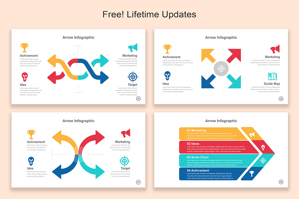
2 Arrow Infographic:
The 2 Arrow Infographic is a straightforward and effective tool for comparing two elements or ideas. You can use it to highlight contrasts, choices, or dualities clearly and concisely.
You may use two two-row infographic designs to point in opposite directions. It is vital to emphasize differences or options. So, it gets easier for the audience to make informed decisions. Common uses of 2 two-row infographics include showcasing the pros and cons of a decision, comparing two product features, or contrasting different approaches to a problem.
3 Arrow Infographic:
The 3 Arrow Infographic illustrates connections among three related concepts or stages in a process. Its unique benefit is the creation of a visual triangle that quickly represents equilibrium, interdependence, or balance among three key elements.
Three-arrow infographics are often used to visualize relationships within a triad of concepts. It includes the presentation of the interplay between people, profit, and the planet in sustainability initiatives.
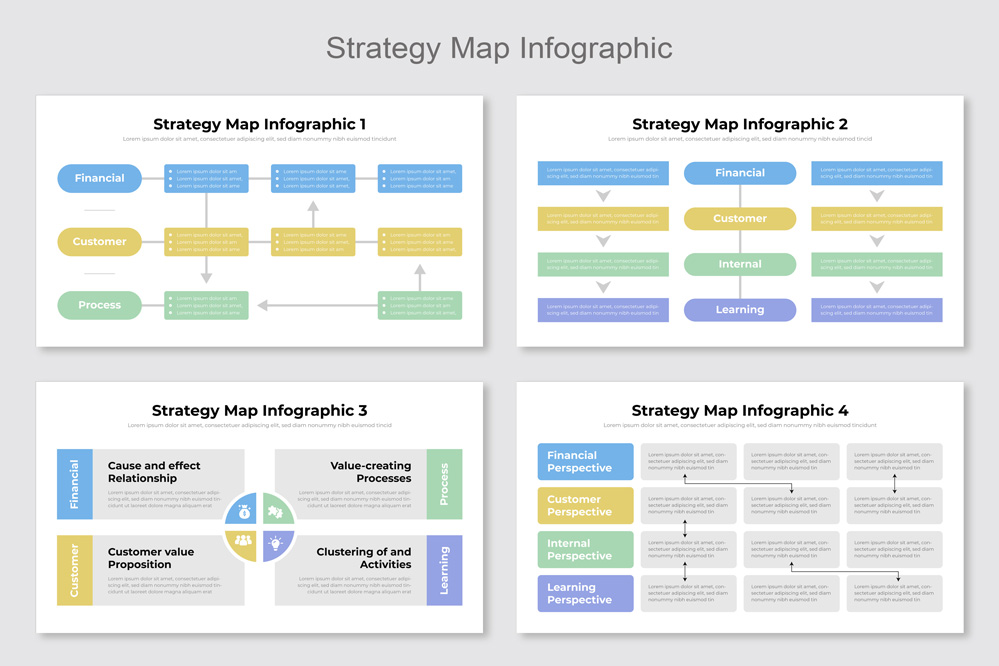
4 Arrow Infographic:
The 4 Arrow Infographic template is valuable for presenting a sequence of four steps or elements. It often presents stats and data in a linear process.
It provides a clear and visually appealing way to guide viewers through a progression. You can use it to show the stages of a project, the steps in a manufacturing process, or the components of a strategic plan. It simplifies complex processes into quick and manageable steps.
5 Arrow Infographic:
When you need to visualize five items, options, or steps, the 5 Arrow Infographic offers a structured presentation. It helps you balance information and makes it easy for the audience to grasp and remember the content.
It’s commonly used in decision-making frameworks, product comparisons, or showcasing five essential aspects of a topic. The structured layout pf 5 arrow infographic design aids in making quick and informed choices.
7 Arrow Infographic:
The 7 Arrow Infographic is a valuable tool to convey seven distinct components or ideas. It maintains a sense of order and completeness in content. It’s suitable for presenting seven key factors, features, or considerations, ensuring no important aspect is left out. For example, it can outline seven essential steps in a project plan.
10 Step Circle Arrow Infographic:
Circular arrows with ten steps form the 10 Step Circle Arrow Infographic templates. Its suitability for illustrating cyclical or continuous processes makes the 10 step circle arrow infographic standout.
Each step leads seamlessly to the next. As a result, it is ideal for depicting project lifecycles, continuous improvement models, or recurring events. It reinforces the idea of ongoing progress and improvement so that people can quickly understand it.
Up and Down Arrow Infographic:
Up and Down Arrow Infographics are versatile for showing growth or decline trends, comparisons, or rankings. They excel at conveying the direction of change. Hence, these arrow infographic templates are valuable to visualizing financial performance, market trends, or the progress of a project.
The upward or downward movement adds context to the data, aiding in easy understanding and quick decision-making.
Direction Arrow Infographic:
Direction Arrow Infographics use arrows pointing in specific directions. It is often used to indicate movement, orientation, or the flow of information.
The directional arrow infographic design guides viewers through spatial layouts. It is helpful to show geographical data, or emphasize directional aspects of a topic. For instance, you can use it to illustrate the movement of goods in a supply chain.
Dotted Arrow Infographic:
Dotted Arrow Infographics feature arrows with dotted lines. Hence, they are ideal for representing non-linear connections or relationships. It is beneficial to illustrate complex interdependencies, network structures, or indirect associations within content.
Moreover, dotted arrow infographic Powerpoint adds depth to visual storytelling. So, audience can visualize and realize intricate relationships with ease.
Vertical Arrow Infographic
Vertical arrows often showcase hierarchy, ranking, or sequential information. Vertical Arrow Infographics offer a straightforward way to present information with a clear top-to-bottom progression. They are ideal for lists, rankings, or displaying sequential data, emphasizing the importance of order or hierarchy.
Curved Arrow Infographic:
Curved Arrow Infographics add a sense of flow or direction to content. Their ability to depict the progression of a process that isn’t strictly linear is remarkable.
You can use curved arrow infographic template to create a dynamic and engaging visual narrative within minutes. So, it is ideal for illustrating natural flow or cyclical patterns in data or concepts.
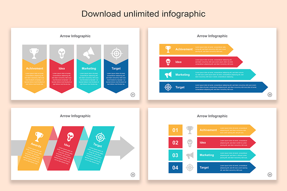
Box Arrow Infographic:
Arrows within boxes combine the clarity of arrows with the organizational structure of boxes. They are effective for emphasizing and organizing content within separate sections. You can use the bow arrow infographic made by Mighty Slide to categorize information or present content hierarchies.
It will help viewers differentiate between sections. Plus, they can quickly understand the relationships between them.
Arrow Timeline Infographic:
Arrow Timeline Infographics incorporate arrows along a timeline. Hence, it provides a chronological context to presentation and content. It is crucial to illustrate historical events, project milestones, or any sequence of events over time.
They are a powerful tool for conveying the progression of time. Also, they can easily highlight significant milestones in a visual and organized manner.
Growth Arrow Infographic:
Growth Arrow Infographics focus on arrows showing upward growth. They are excellent for visualizing progress, achievements, or performance improvements over time. They showcase positive trends and motivating stakeholders. They are commonly used in business reports, financial presentations, and goal tracking.
Key Features of Arrow Infographics:
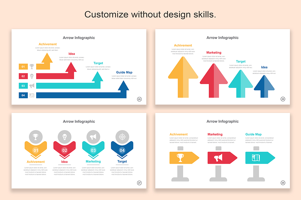
- Dynamic Arrow Designs: Explore dynamic arrow infographic layouts with a modern and minimalist flair.
- Effortless Customization: Enjoy full editability and one-click downloads in PPTX format, perfect for PowerPoint, Keynote, Google Slides, Illustrator, and Canva.
- Versatile Usage: Whether for digital or print, these arrow infographics are optimized for both, and commercial licensing is included.
- Flow Visualization: Use arrows to effortlessly guide your audience through your content, enhancing comprehension and engagement.
- Color-Coded Templates: Utilize color-coded templates to maintain consistency and easily match your branding while highlighting key points with precision.
Different Uses of Arrow Infographic Design And Templates:
You can download the arrow infographic templates from Mighty Slide and customize them for versatile uses. It will pop-up your content, presentation and webpages.
- Marketing: Visualizing Marketing Funnels, Customer Journeys, Sales Pipelines
- Finance: Demonstrating Financial Trends, Investment Strategies, Budget Allocation
- Education: Timelines, Process Explanations, Student Progress Tracking
- Healthcare: Patient Care Pathways, Medical Processes, Healthcare Workflow
- Business: Project Timelines, Strategy Planning, Workflow Visualization
- Technology: Software Development Flow, Workflow Processes, Project Roadmaps
- Manufacturing: Production Processes, Quality Control, Inventory Management
- Real Estate: Property Market Trends, Investment Opportunities, Property Valuation
- Retail: Sales and Marketing Strategies, Inventory Management, Customer Flow
- Environmental: Environmental Impact Assessments, Sustainability Efforts, Compliance Tracking
- Entertainment: Content Creation Workflows, Project Timelines, Event Planning
- Non-Profit: Fundraising Progress, Impact Assessments, Volunteer Onboarding
Conclusion
Each type of arrow infographic template offers a unique way to convey information. It is crucial to choose the one that best fits the message and purpose of your content from our list of arrow infographic designs. As you select the right type and utilize it effectively, you can enhance the impact and clarity of your visual communication.
Share Now!
Purchase
$0.00
Compatibility
Unlock this Template
Arrow Infographics Templates
mighty-infographics
Related Products