


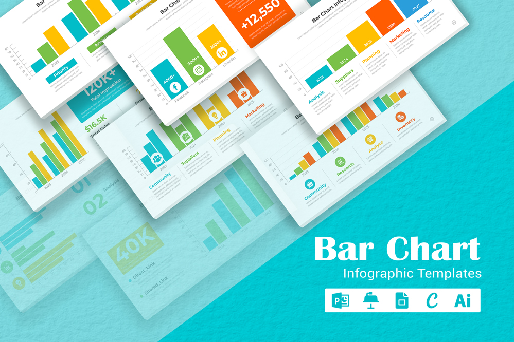
Bar Chart Infographic Template


Unlocking Data Visualization: The Ultimate Bar Chart Infographic Template
Editing a bar chart infographic involves customizing the chart layout, adjusting the content, and changing colors to match your needs. This guide provides detailed steps on how to edit a bar chart infographic design, change its colors, and understand its various applications.
Open the Infographic Template:
Start by opening the bar chart infographic template in graphic design software such as PowerPoint, keynote, or Adobe Illustrator. Ensure you have access to all elements and layers within the template for editing.
Assess the Layout:
- Review the current layout of the bar chart within the infographic. Bar charts typically display data comparisons, so ensure the layout effectively communicates your message.
- Check the orientation (horizontal or vertical bars) and the scale of the chart. If necessary, adjust the axes to better represent your data.
- Rearrange other infographic elements, like titles, labels, and supporting text, to ensure a balanced and visually appealing design.
Modifying the Bars:
- Click on the bars in the chart to select them. You can resize the bars to reflect new data or to adjust the visual balance.
- You may also want to change the width or spacing of the bars for better readability, especially if the chart contains a large number of data points.
Changing Colors:
- Colors play a key role in making the bar chart visually appealing and easy to interpret. To change colors: – Select the bars, background, or any other elements you want to recolor.
- Use the color picker tool to choose new colors. Consider using different colors for each bar or grouping similar data with the same color.
- Ensure that the colors you choose are easy to distinguish from one another, especially if the chart includes multiple data sets. High contrast between the bars and background will enhance readability.
- If the infographic includes a color legend, update it to match the new color scheme.
Uses of a Bar Chart Infographic:
- Data Comparison: Bar chart infographics are ideal for comparing different data sets, such as sales figures, survey results, or performance metrics.
- Business Presentations: Use bar chart infographics in business reports or presentations to visually represent key data points, making it easier for stakeholders to understand and analyze the information.
- Educational Materials: Teachers and educators can use bar chart infographics to explain statistical data, trends, or comparisons in a visually engaging way.
- Marketing and Analysis: Marketers can use bar chart infographics to showcase market research findings, customer preferences, or product performance in a clear and concise format.
By following these steps, you can effectively edit a bar chart infographic design to suit your specific needs, creating a powerful visual tool for communicating data and insights across various contexts.
Share Now!
Bar Chart Infographic Template
mighty-infographics
Related Products


