


Circle Chart Infographic

Mastering Circle Charts: A Comprehensive Guide to Circle Chart Infographics
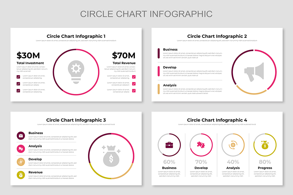
Circle charts, also known as pie charts, are graphical representations used to show the proportions of different categories within a whole. Each segment of the circle represents a category’s contribution to the total, making it easy to compare parts of a dataset. These charts are particularly useful when you want to illustrate the percentage distribution of data, making them ideal for business reports, presentations, and infographics.
When to Use Circle Charts Circle charts are best used when you have categorical data that adds up to a whole. They are particularly effective when comparing parts to the whole, rather than comparing individual categories to each other.
Advantages of Circle Charts
- Visual Simplicity: Easy to understand at a glance.
- Immediate Comparison: Clearly shows proportions and percentage distribution.
- Effective for Small Data Sets: Ideal for datasets with a limited number of categories.
Share Now!
Circle Chart Infographic
circle-infographics
Related Products


